This is not the KFC I grew up with!
- Jun 12, 2015
- 2 min read
Okay, can I just say up front, I only eat at KFC about once a year. It does not win any awards for being healthy but every now and then I like to visit my childhood memories. A bucket of KFC after our evening church service in Ohio was a mighty fine finish to a weekend. And then there was the time my mother decided we would have Easter lunch at the beach with a bucket of KFC. Gotta love spontaneity.
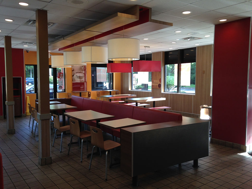
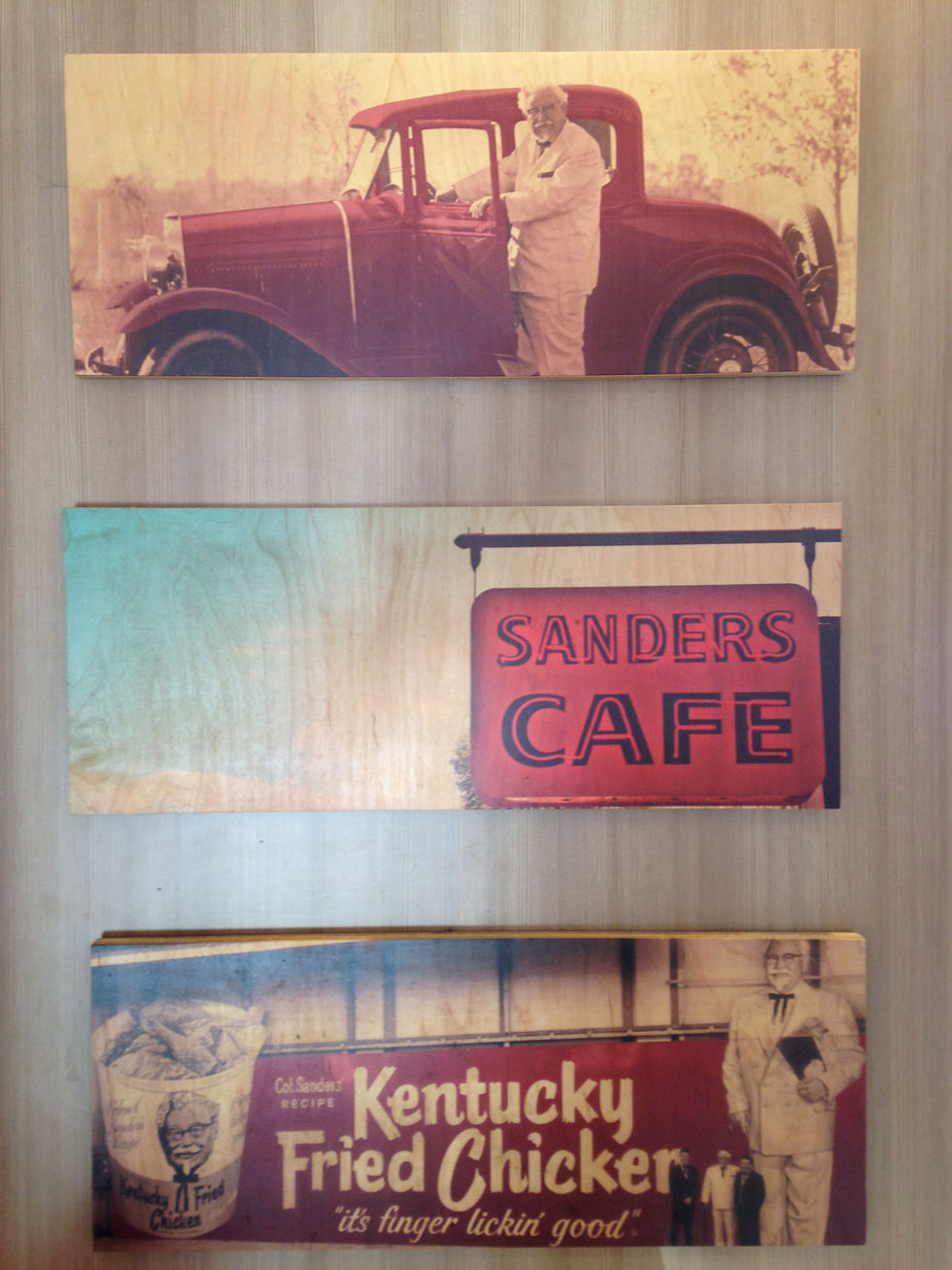
On a recent drive from the north, hubby and I stopped off at a KFC near Daytona, FL. Hello! Interiors were updated, fresh and modern. Wall graphics combined the history of KFC with subtle marketing messages. They were both graphically appealing and nostalgic.
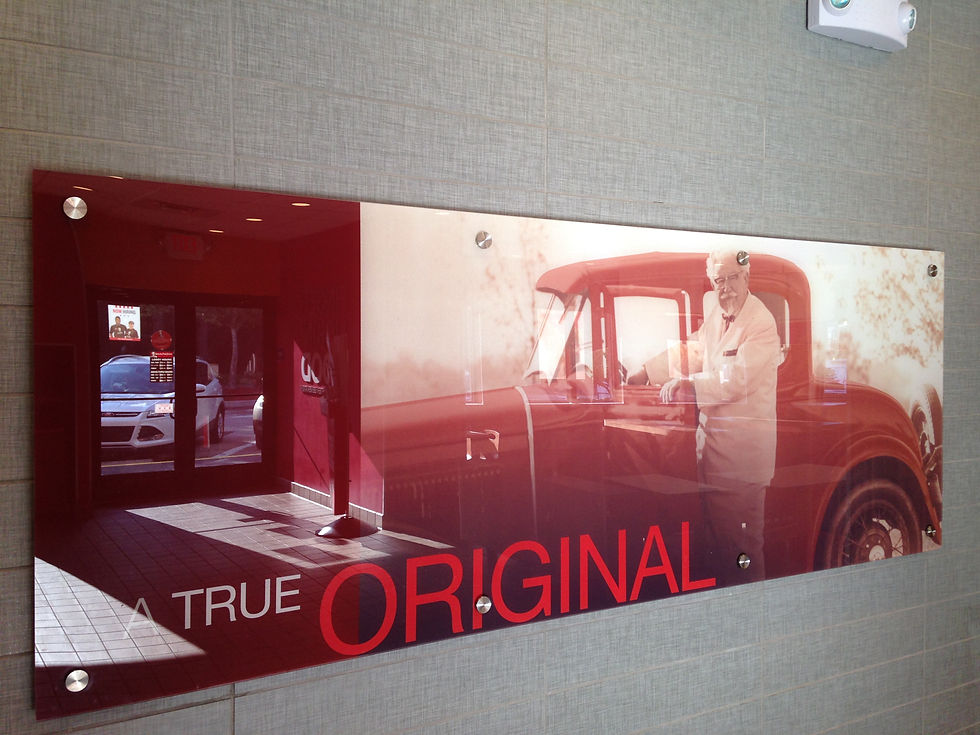
There is something to a brand that has a man (or woman) behind it that makes a human connection. You mean there really was a guy that had white hair and a goatee, wore a white suit and black bowtie? And don't forget the glasses! They did not miss a beat in drawing all the connections.

What a great use of the Instagram filter, a vintage look for vintage posters!

And the finishes. Yes it is formica, but trendy. And simple.
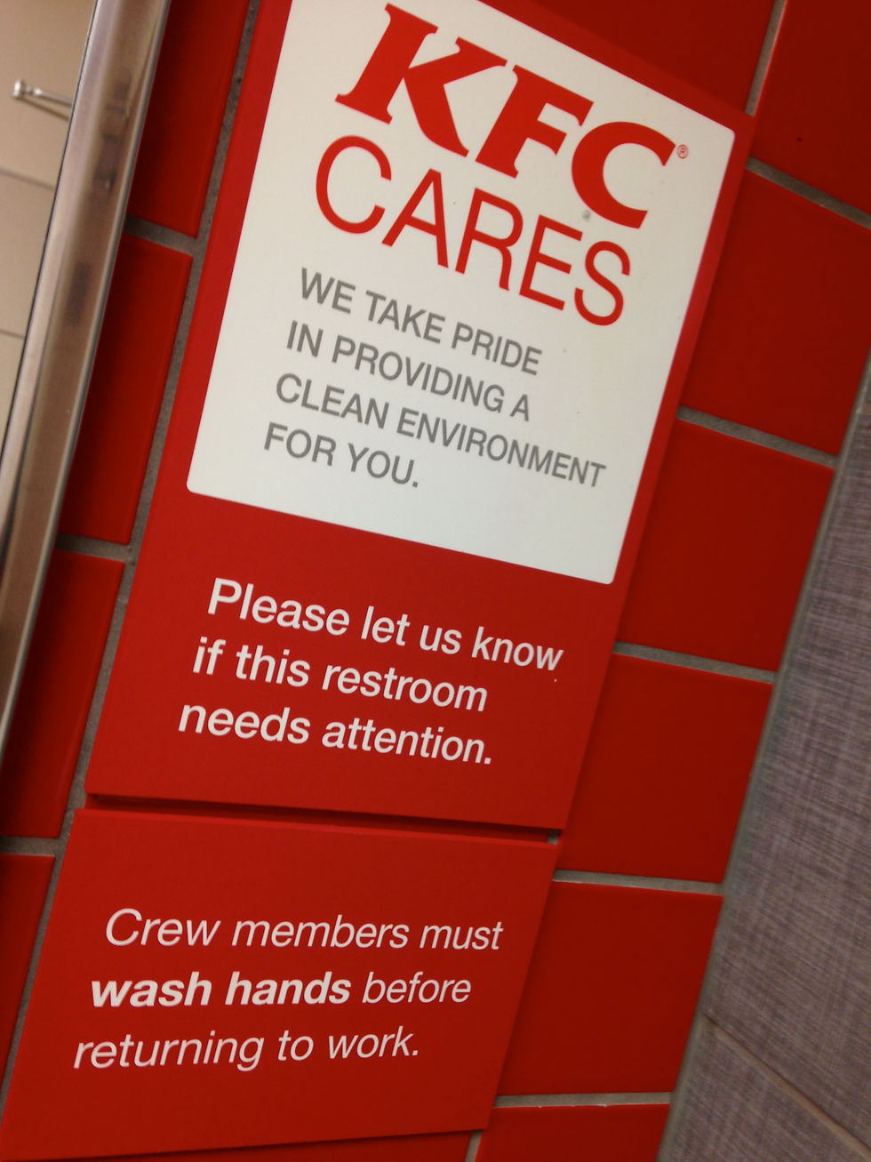
This was the winner though. Have you ever seen such a beautiful restroom sign?
Down to the very last detail, the finger licking KFC brand is consistent, attractive, bold and somewhat inspriational. The store (at least the one I visited) is surprisingly attractive, product has not changed much in my opinion, and they know how greasy that chicken is and that is why they provide the wipes!


Comments